Brand Guidelines & Visual Identity
December 2025
Brand Guidelines & Visual Identity
December 2025
01
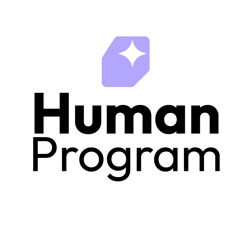
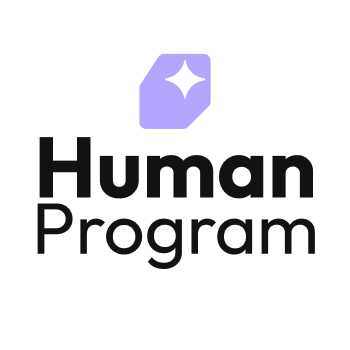
The Human Program logo consists of a distinctive star icon within a tilted rounded rectangle, paired with the wordmark.
Download Assets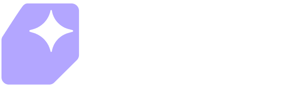 Primary — Dark Background
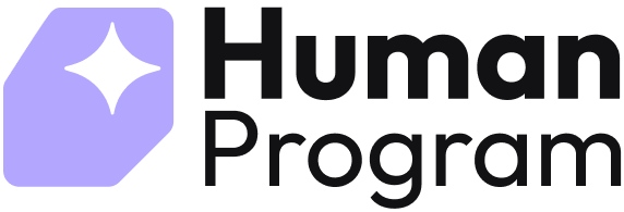 Primary — Light Background
 Reversed — Brand Background
 Badge — Dark
 Badge — Light
02
Our core color system built around neutral tones and signature lilac accent.
White
#FFFFFF
Lightest
#EBEFF8
Lighter
#C8CEDA
Light
#A5ACBA
Neutral
#82899A
Dark
#5F6678
Darker
#3C4354
Darkest
#1B1F29
Lightest
#F4F2FF
Lighter
#E9E5FF
Light
#B3A6FF
Lilac
#9381FF
Dark
#7567CC
Darker
#413872
Darkest
#2C264C
02
Extended palette for UI states, feedback, and visual variety.
Lightest
#FFF6ED
Lighter
#FFDDB8
Light
#FFC278
Orange
#FFA53A
Dark
#D4851E
Darker
#9C5F10
Darkest
#5C3709
Lightest
#FFE8E8
Lighter
#FCCFCF
Light
#FFB3B3
Pink
#FF8686
Dark
#B44C4A
Darker
#5C2726
Darkest
#4A2323
Lightest
#F1FBFF
Lighter
#E4F7FF
Light
#A0E3FF
Blue
#78D7FF
Dark
#60ACCC
Darker
#296E90
Darkest
#1B3F5A
Lightest
#FAFFEB
Lighter
#ECFAAB
Light
#D6F268
Green
#C0E832
Dark
#9FC426
Darker
#749119
Darkest
#455710
03
Outfit is our primary typeface — modern, geometric, and highly legible across all sizes.
Download Outfit Font04
Consistent spacing tokens for layout and component design. Values shown as Desktop / Mobile.
05
Border radius and stroke specifications for consistent component styling.
None0px
X-Small5px
Small12px
Medium24px
Large50px
Round999px
Border1px
Divider2px
06
Visual guidelines for the Human Program mobile and desktop applications in dark and light themes.
Download Assets
Neutral Darkest background with color icon.
Lilac brand background with white icon.
User profile with dark background and brand color cards.
User profile with light background and brand color cards.